library(pacman)
p_load(tidyverse, sf, rio, rnaturalearth, rnaturalearthdata, ggspatial)Point Map of the Ancient World, Made in R
Specifically, with the {ggplot2} package instead of {leaflet}
Take me home
To return to the first page–the one with the {leaflet}-based process–click here.
1 Setup
Load packages.
Load data.
df <- import("archestratos_rmaps.csv") %>%
  tibble()
2 Make the map
2.1 Prepare the base map
Load the base world map.
world <- ne_countries(scale = "medium", returnclass = "sf")

# Fix invalid geometries (if any)
world <- st_make_valid(world)

# Check and set CRS
if (is.na(st_crs(world))) {
  world <- st_set_crs(world, 4326)
} else if (st_crs(world)$epsg != 4326) {
  world <- st_transform(world, crs = 4326)
}

# Define the Mediterranean extent
med_extent <- c(xmin = -10, xmax = 40, ymin = 20, ymax = 50)

# Manually create the bounding box if st_bbox fails
med_bbox <- st_polygon(list(rbind(
  c(med_extent["xmin"], med_extent["ymin"]), # Bottom-left
  c(med_extent["xmin"], med_extent["ymax"]), # Top-left
  c(med_extent["xmax"], med_extent["ymax"]), # Top-right
  c(med_extent["xmax"], med_extent["ymin"]), # Bottom-right
  c(med_extent["xmin"], med_extent["ymin"])  # Close the polygon
))) %>%
  st_sfc(crs = st_crs(world)) # Assign the CRS

# Crop the map using the bounding box
med_map <- st_intersection(world, med_bbox)

# Plot the cropped map
p1 <- med_map %>%
  ggplot() +
  geom_sf(
    #fill = "antiquewhite",
    fill = "khaki3",
    color = "black") +
  labs(title = "Mediterranean Region in Antiquity")

p1 +
  theme_minimal()
2.2 Wrestle with coordinates and the shapefile format
Convert our data to an sf object
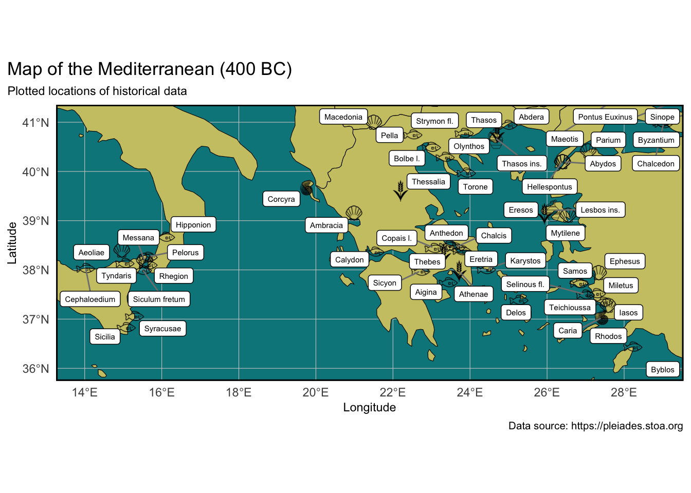
data_sf <- st_as_sf(df, coords = c("lon", "lat"), crs = 4326)2.3 Prepare icons


The icons are each 150x150px in size, but the display size is controlled in the ggplot code below.
We prepare graphic files of icons for our five food types: fish, grain, invertebrates, wine, and shellfish. - The paths to the (local) graphic files are stored in a tibble called icon_mapping.
p_load(ggimage)

# Define icons for each FoodType
icon_mapping <- tibble(
  FoodType = c("fish", "shellfish", "grain", "invertebrates", "wine"),
  icon = c("img/1.png",
           "img/2.png",
           "img/3.png",
           "img/4.png",
           "img/5.png")
)

# Merge icons with data
df <- left_join(df, icon_mapping, by = "FoodType")
2.4 De-dupe icons and location markers
Because {ggplot2} forces us to work in a static format (as opposed to interactive, like {leaflet}), we only have room for one item per location. So we want to de-dupe the data and keep only the first entry for each location.
# Deduplicate data for labels
df_labels <- df %>%
  group_by(Location) %>%
  slice(1) %>%
  ungroup()

# Deduplicate icons by Location
df_icons <- df %>%
  group_by(Location, lon, lat) %>%
  slice(1) %>%
  ungroup()
2.5 Plot points, i.e. create the map object
Now we plot the map, starting from the base map we made above and saved as p1, and then adding our custom information/data layer by layer.
# load {ggrepel}, which provides automatic
# jitter to text labels (here: our location labels)
p_load(ggrepel)

p2 <- p1 + # Start with the base map (p1)

  # Add layer: FoodType icons at each location
  geom_image(data = df_icons, aes(x = lon, y = lat, image = icon),
             size = 0.1) +

  # Add layer: non-overlapping text labels
  geom_label_repel(data = df_labels,
                   aes(x = lon, y = lat,
                       label = Location),
                   size = 2,
                   max.overlaps = 200,
                   box.padding = 0.2,
                   point.padding = 0.1,
                   segment.color = "grey50",
                   label.size = 0.25,
                   fill = "white",
                   color = "black") +

  # Add layer: text labels on the map
  labs(title = "Map of the Mediterranean (400 BC)",
       subtitle =
         "Plotted locations of historical data",
       x = "Longitude", y = "Latitude",
       caption = "Data source: https://pleiades.stoa.org"
       ) +

  # Apply a default aesthetic theme to plot
  theme_minimal() +

  # Use the theme() function to add detail to
  # some of the graphical aspects, e.g. font sizes,
  # colors, line weight, etc.
  theme(panel.background =
          #element_rect(fill = "lightblue"),
          element_rect(fill = "turquoise4"),
        legend.position = "none",
        #plot.title = element_text(size = rel(0.8)),
        plot.subtitle = element_text(size = rel(0.8)),
        plot.caption = element_text(size = rel(0.7)),
        axis.title = element_text(size = rel(0.8)),
        axis.text = element_text(size = rel(0.8)),
        plot.title.position = 'plot',
        panel.border =
          element_rect(color = "black", fill = NA, size = 1),
        panel.grid.major =
          element_line(color = "grey80", size = 0.2),
        panel.grid.minor =
          element_line(color = "grey90", size = 0.1)
  ) +

  # Zoom into the region of interest -
  # these are hand-adjusted values
  coord_sf(xlim = c(14, 28.8),
           ylim = c(36, 41.1))
3 Output the map to screen
The map has now been created as p2, so we can go ahead and output it to screen.
Another option would be to output the map object p2 to a graphic file which could then be used in a document, e.g. as a PNG or JPG, by running this function:
ggsave("my_mediterranean_map.png", plot=p2, width = 6, height = 4, units = "in").
# Display the map
p2